


When the yield curve flattens and eventually inverts, you worry.
But it’s when a recession hits, the Fed cuts rates and the curve steepens that you become s**t scared.
Yield curve dynamics represent a crucial macro variable, as they inform us on today’s borrowing conditions and on the market future expectations for growth and inflation.
An inverted yield curve often leads towards a recession because it chokes real-economy agents off with tight credit conditions (high front-end yields) which are reflected in weak future growth and inflation expectations (lower long-dated yields).
A steep yield curve instead signals accessible borrowing costs (low front-end yields) feeding into expectations for solid growth and inflation down the road (high long-dated yields).
Rapid changes in the shape of the yield curve at different stages of the cycle are a key macro variable to understand and incorporate in your portfolio allocation process.
Hence, in this piece we will:
Quickly walk you through the different yield curve regimes (i.e. bull steepening, bear flattening etc);
Assess these curve regimes within the growth environment, and derive important cross-asset macro signals;
Take a look at today’s yield curve regime.
There are 4 main yield curve regimes to consider:
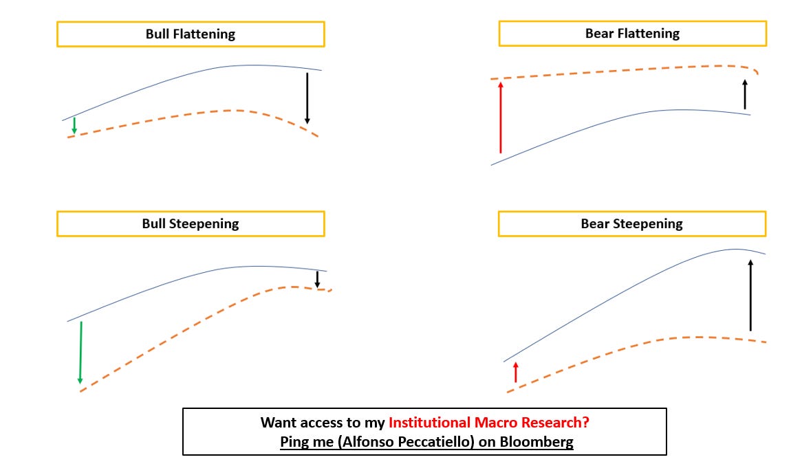
Bull Flattening = lower front-end yields, flatter curves.
Think of 2016: Fed Funds already basically at 0% and weak global growth. Yields stay put at the front-end and could meaningfully move lower only at the long-end, hence bull-flattening the curve.
Bull Steepening = lower front-end yields, steeper curves.
Late 2020, early 2021: the Fed was keeping rates pinned at 0% and stimulating via QE but the economy was flooded with fiscal stimulus and ready for reopening. The friendly borrowing conditions and the massive upcoming growth boost could mostly be reflected through higher long-end yields, while 2-year interest rates were pinned at 0% by the Fed. Bull-steepening of the curve.
Bear Flattening = higher front-end yields, flatter curves.
2022 was the bear flattening year: Powell raised rates aggressively to fight inflation, but he ended up choking the economy off. This was reflected in lower future growth and inflation expectations at the long-end of the curve. Front-end rates went higher, but the curve bear-flattened.
Bear Steepening = higher front-end yields, steeper curves.
Do you remember 2009? The worst of the GFC was behind us and (monetary-mechanics-illiterate) investors were afraid that QE would lead to runaway inflation and the Fed would be forced to start acting on it. Front-end yields moved a bit higher, but long-end yields took most of the hit as investors (mistakenly) bumped the inflation risk premium up = the curve bear-steepened.
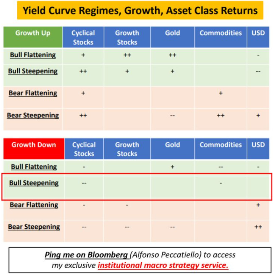
Rapid changes in the shape of the yield curve when growth is at turning points are a key variable to consider for a successful asset allocation process.
Here is a Yield Curve Cheat Sheet you can use:
Let’s see some quick examples.
In 2024 the yield curve has mostly bear flattened while economists were busy revising growth prospects higher.
👉 Take a look at ''Growth Up + Bear Flattening''.
What does that imply, and what asset classes benefit the most from this combination?
1️⃣ Cyclical stocks
2️⃣ Commodities
In an environment where growth is moving higher and the market is busy repricing away cuts (= the curve bear flattens as rates move up mostly at the front-end), the ''Old Economy'' does well: value, cyclical, energy-related stocks deliver solid performance as the growth cycle is re-rating higher.
And these sectors don't need lower rates to thrive: they just need strong economic activity.
But now let's take another example: what if growth slows down, and the Fed is forced to cut rates faster?
👉 Take a look at ''Growth Down + Bull Steepening''.
Well, in that case cyclical stocks and commodities actually do poorly.
The yield curve bull steepens as the Fed is called to urgently cut interest rates because economic conditions are deteriorating.
As you can see, understand yield curve dynamics in the context of the growth setup can provide with important cross-asset macro signals.
But where are we today?
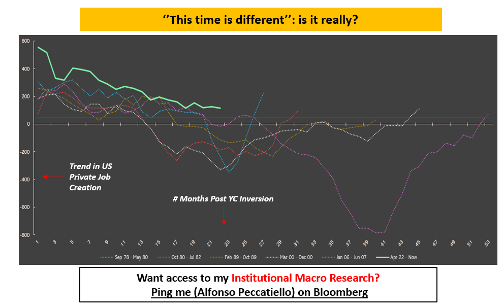
The chart below shows the trend in US private job creation (blue) in the months following a persistent yield curve inversion.
The red colored area is consistent with the onset of recessionary conditions, and the green dotted line signals a dis-inversion of the curve.
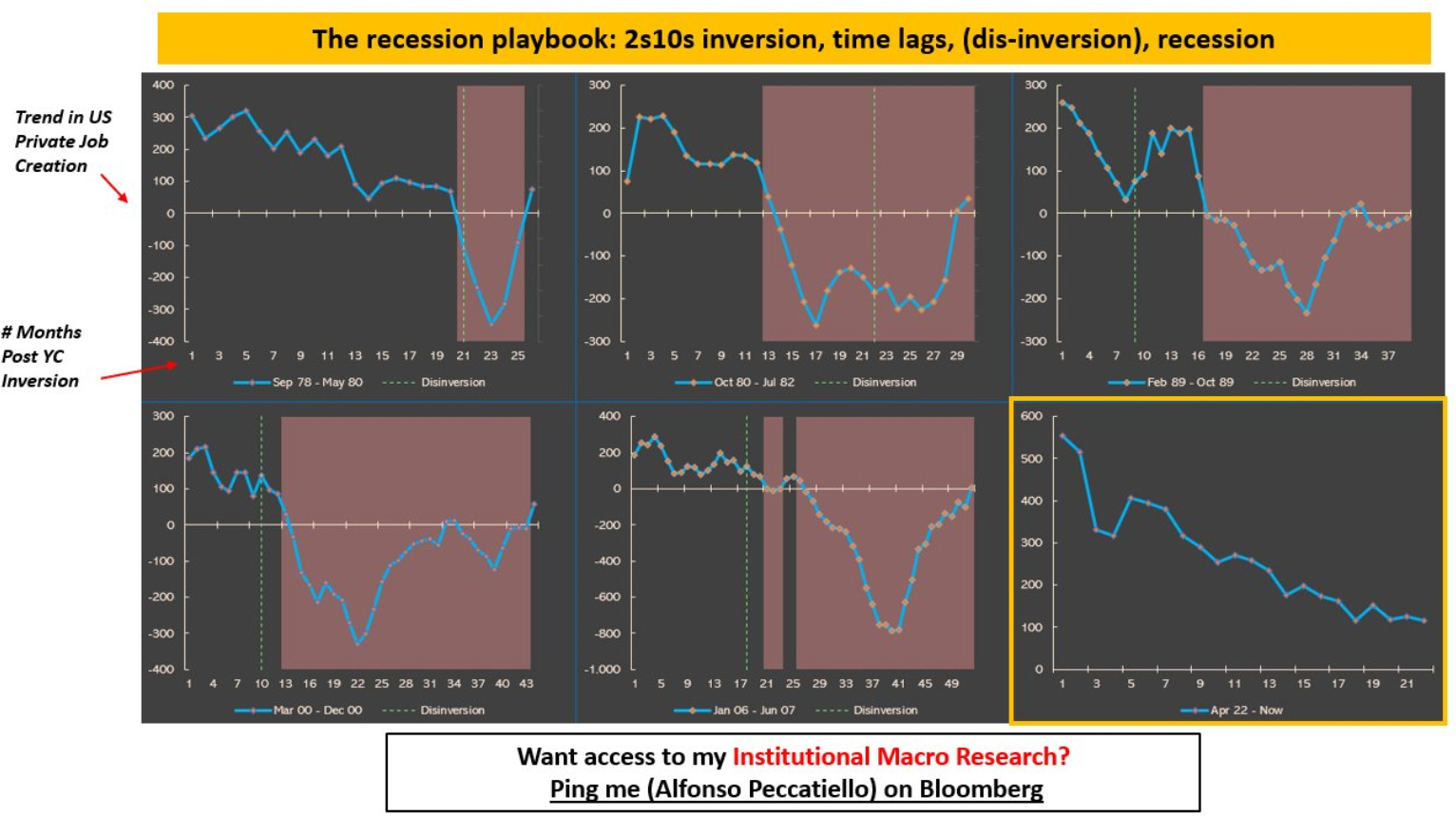
See the pattern:
1) Every recession since the 1970s was preceeded by a yield curve inversion
2) The timing between the initial inversion and the start of a recession varies: in the early 80s or 2000s recession it was as little as 12 months, while in 2008 it took 27 months (!) for the macro lags to appear
3) Today the yield curve has been inverted for over 20 months and counting, and private sector job creation has slowed down a lot.
A potential dis-inversion right here (green dotted line) would be the last step in the historical recessionary sequence.
The US economy has proven to be way stronger and stubborn than many expected, but the jury is still out.
‘‘Is this time different’’?
Thanks for reading!
If you enjoyed this piece, let me know by smashing that Like button.
And feel free to share it with friends and colleagues!
P.S. I am launching my Macro Hedge Fund!
Interested to know more?
The email address to reach me at is the following:
fund@themacrocompass.com


Yield Curve 101