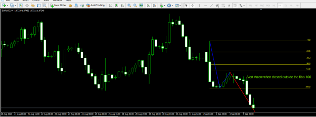
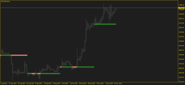
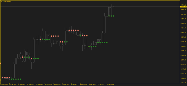
Disliked{quote} Does this make any sense to you? {image} Each of those arrows meets your conditions... It looks better if I do something, but still, is it worth the time? {image}Ignored
I see what you mean. The first chart makes NO sense for sure. The second is one is somewhat better. What is the difference in the first from the second one? Maybe I didn't state the parameters correctly.