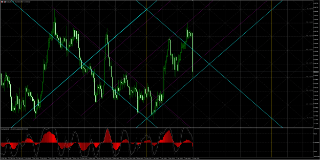
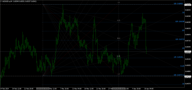
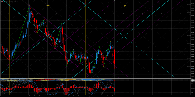
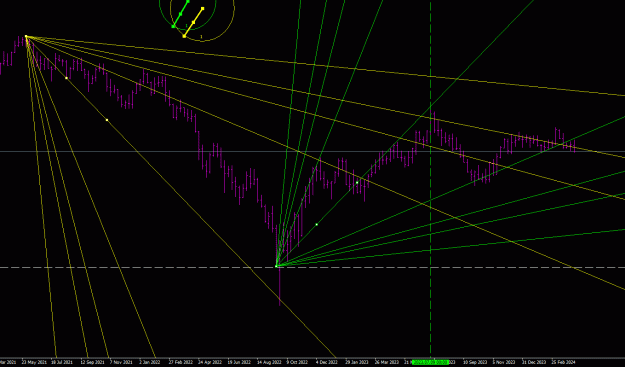
AUDUSD 1H
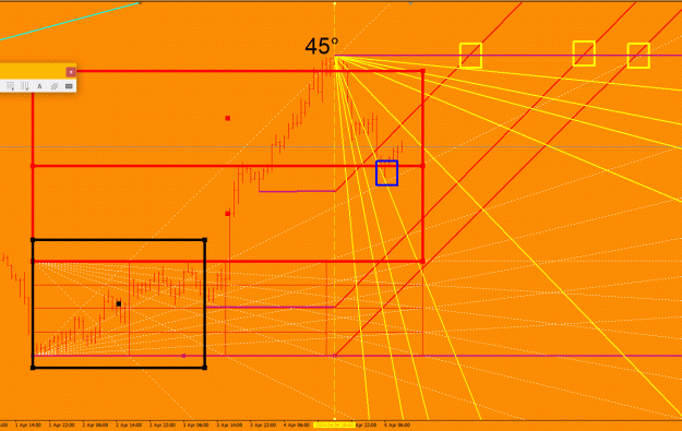
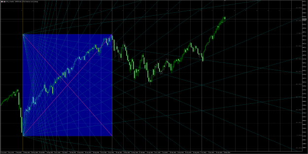
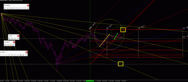
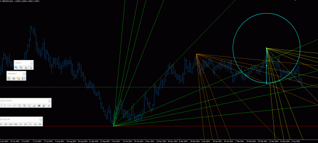
It's the first time I've ever tried this method, which I'll explain now: the black square delimits the 2-day cycle from minimum to minimum (but I could also have considered the 1-day cycle). from this 2 day cycle I drew the GANN BOX and the 45° line stopped the climb.
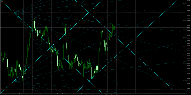
the 2 red rectangles highlight how the top was made (3 times the GANN BOX)
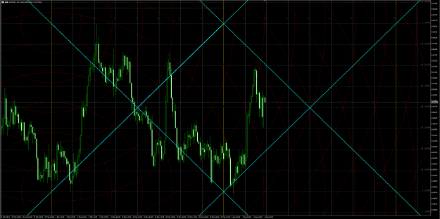
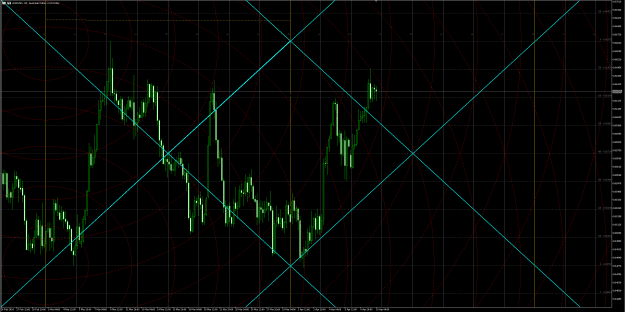
the blue square is where AUDUSD stopped its decline. The yellow squares indicate the time setups obtained by joining the minimum points to the vertical from the top and from this I started the lines at 45° as Jenkins explains
as jenkins says, the first pulse is the seed of the plant so this is why I chose the first 2 day cycle with increasing minimum
It's the first time I've ever tried this method, which I'll explain now: the black square delimits the 2-day cycle from minimum to minimum (but I could also have considered the 1-day cycle). from this 2 day cycle I drew the GANN BOX and the 45° line stopped the climb.
the 2 red rectangles highlight how the top was made (3 times the GANN BOX)
the blue square is where AUDUSD stopped its decline. The yellow squares indicate the time setups obtained by joining the minimum points to the vertical from the top and from this I started the lines at 45° as Jenkins explains
as jenkins says, the first pulse is the seed of the plant so this is why I chose the first 2 day cycle with increasing minimum
Attached Image (click to enlarge)