![]() ► #Financial #Markets #Observatory #Lab. ◀
► #Financial #Markets #Observatory #Lab. ◀![]()
Some notes/charts about the indicator ''US Gov.Bond 30y'' vs. ''Gold spot'': the graphical pyramid was completed???
Aim of the post.
☒ In this post there are some notes about the ratio (in two chart-formats) between the prices of '''US Gov.Bond 30y''' vs. '''Gold spot'', in order to obtain infomations about the trend type of the Gold from the top of 2011, according to preliminary data published in (#1) & (#2).
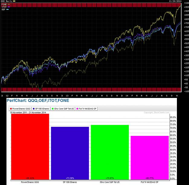
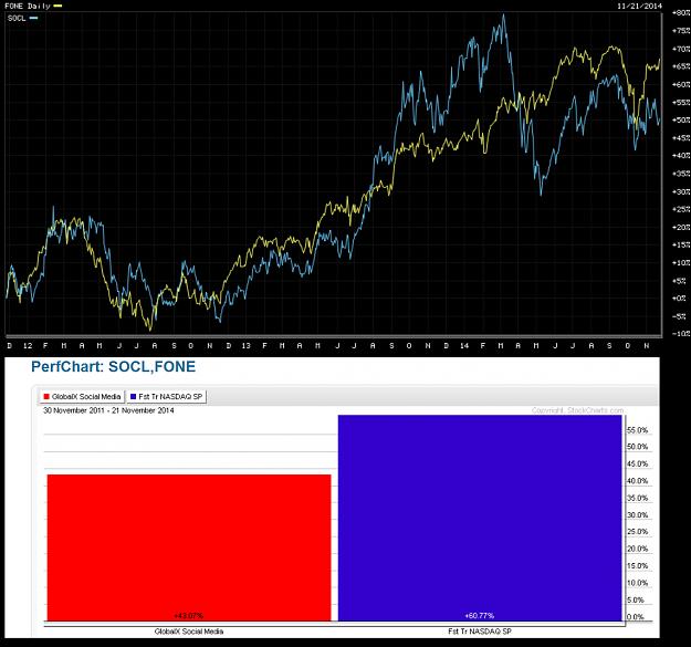
General stocks-benchmarks usefull for this post.
► global U.S. stocks-benchmarks (charts & notes: EUSA; ITOT; IWB; IWV; IYY; THRK);
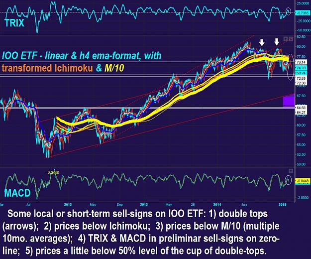
► global World stocks-benchmarks (charts & notes: ACWI; DGT; IOO; NYSE W.L.I.; ONEF; VT).
Main graphical elements.
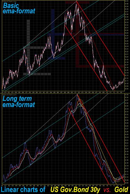
☒ The main graphical elements are as follows (see the attached charts).
✔ The ratio-curve shows two impressive trends from 1980, with a completed pyramid-like structure: a.) 21 years, from 1980 to 2001 (Gold Sell ʕ•ᴥ•ʔ Off & price-stagnation); b.) 11 years (about 50% of previous ratio price-action), from 2011 to 2011 ( Gold Sky��Rocket ).
✔ The key elements of the stop of bullish action of ratio during the phase 1980-2001, are the followings: a.) long-term bearish ema-knot in set-up with the return-level inside the blue ascending channel (yellow circle); b.) ratio below the white ascending channel (2003); c.) ratio below the blue ascending channel (2003-2004).
✔ Two interesting graphical bullish cups are marked on the basic ema-format: -) gray cup (1986-1992) with a perfect re-test of its 50% level (see the target); -) blue cup (1993-1997; see the test of its neck-line after the target in 1998).
✔ The bear of ratio 2001-2011 is very fast & hard (see the descending thin yellow or red line), with curve inside a bold & red descending channel, and with a new low-area about in-line with the lows of 1980!!!
✔ An interesting peak structure is the large bearish cup (1999-2003), with currente ratio-curve well below the target (low of 2006 & top of 2008).
✔ A first reversal event of curve there is in 2012 (curve above thin descending line).
✔ A second reversal reversal event of curve there is in 2013 (bullish ema-knot in yellow circle).
✔ An advanced reversal attempt on long-term ema-format, and imminent reversal attempt on basal ema-format, there is with the break-test of the bold & red descending channel.
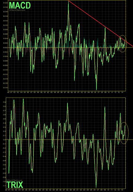
✔ Reversal events are recognizable also on MACD & TRIX curves.
Notes.
☒ The graphical pyramid of ratio-curve is completed. For a long term phenomenon about the ratio vs. equity benchmarks see reference (#3).
Bearish side shows a slope 2X fast vs. bullish side; according with this phenomenon, the previous historical run of Gold-spot was ~1970-1980, or ~11y (#4).
There is an high probability of new decreases of Gold in the next months.
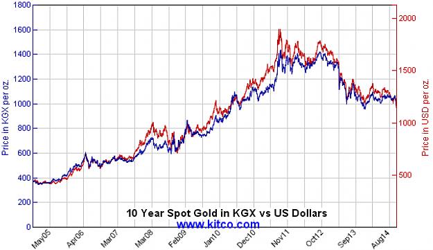
Current levels of Gold are in perfect test with the published Graphical��Ɖetonator (#1): 1179-1144.
Below this level, there are the folowing price-clusters (#1): 1089-1029; 924; 893-878.5-861; 695-691.
According to ''US/Gov.Bond30y'' vs. ''Gold spot'' ratio, is it possible the start in 2011 of a new two-decades of bearish-side evolution of Gold ???
Or it is possible a big correction of Gold below the Graphical��Ɖetonator, and with the ''US/Gov.Bond30y'' vs. ''Gold spot'' ratio toward the dark-red zone (low of 2006 & top of 2008)??? In this last case (according to price study in reference #1), there is a possible test of the area 1089 (50% Fib. projection) and 924 (current triple lows target).
If the Gold-spot do not goes below the Graphical��Ɖetonator, there will be a return movement toward the zone of current triple-lows (see reference #1 for upper price-cluster).
Follows these alert levels/events:
✔ Graphical��Ɖetonator and next price-clusters !!!
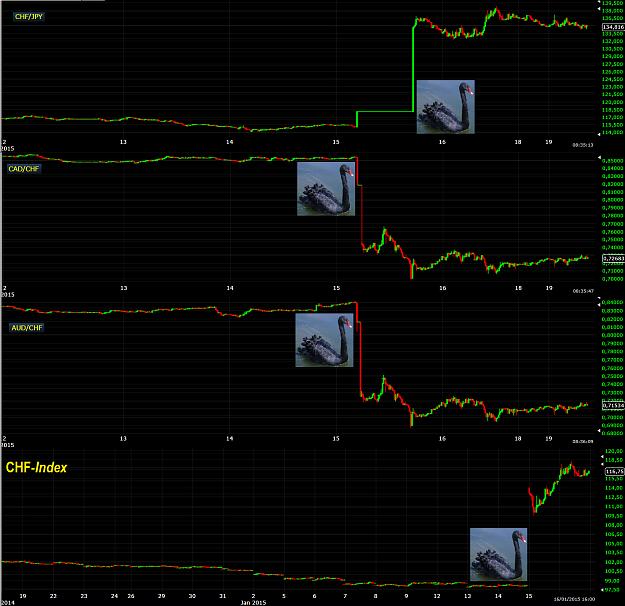
✔ Switzerland referendum on Gold in SNB (#5).
✔ The possible ''US/Gov.Bond30y'' vs. ''Gold spot'' ratio well above the bold & red descending channel (toward the zone 2006-low/2008-top).
References.
#1.-https://www.researchgate.net/publication/266402749_Financial_Markets_Observatory_Lab._Some_notescharts_about_the_graphical_structures_of_Gold_Au
#2.-https://www.researchgate.net/publication/267327026_Financial_Markets_Observatory_Lab._Some_notescharts_about_some_indicators_of_Gold_Miners_Index
#3.-https://www.researchgate.net/publication/260121930_Financial_Markets_Observatory_Lab._Some_notescharts_about_the_very_long-term_Au_vs._Dow_Jones_30_Index
#4.-https://www.researchgate.net/publication/260284924_Financial_Markets_Observatory_Lab._Short_update_of_Gold__Au__analysis
#5.-https://www.facebook.com/SalVi.SalvatoreVicidomini/posts/855899071108424
Chart sources.
❖ StockCharts.
Sorry for my bad English. I hope that this post is at least minimally useful [Contact].
Tuned on main trend, but follows short-medium term signs from underlying prices, for a correct & real-time set-up.
It is very important do not anticipate the main trend of the underlying financial instruments.
☻/♪ ❖ EARTH.pk, Alert 2.O !!! ❖
/▌
/|
I.M.O. by Sa!Vi ►►♥
#KèSaddhaPhàPéKampà: #BundaBunda €MP¥R€ ❣!!!❣
Attached Image(s) (click to enlarge)